MY ROLE
4th Hire
Branding
COMPANY
Sofia
CREATED
2019
A brand to break old industry perceptions
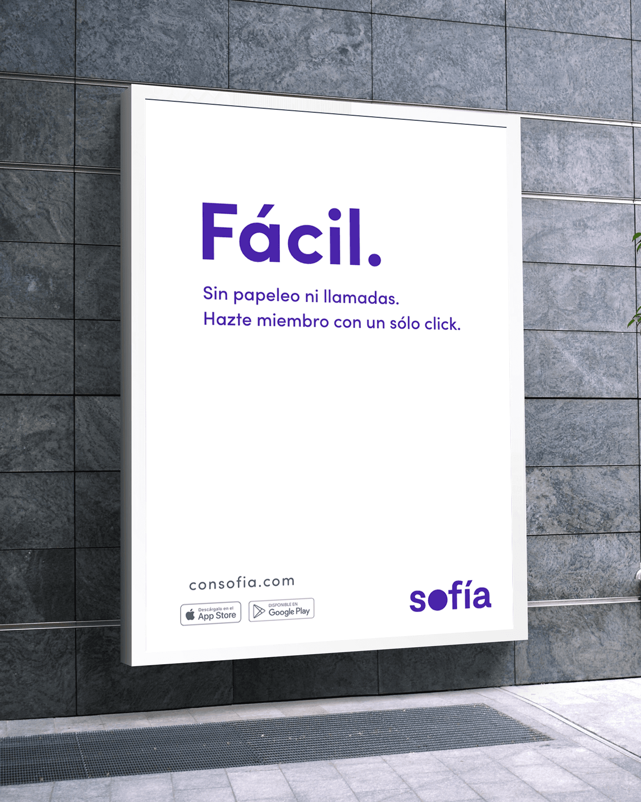
Sofía is radically different from any health insurance company in Latin America. The brand is all about innovation and people. It voices a young, rebel and creative spirit with a simple, honest and human message.


The circle, a symbol for a movement
The circle embodies wholeness, reliability and movement. It's the antithesis of a square, rigid, closed-minded insurance world. The purple represents wisdom (Sofía in latin is wisdom), ambition and abundance.


Square vs Circle Marketing Strategy by Alberto Montalti
A BEAUTIFUL TYPEFACE
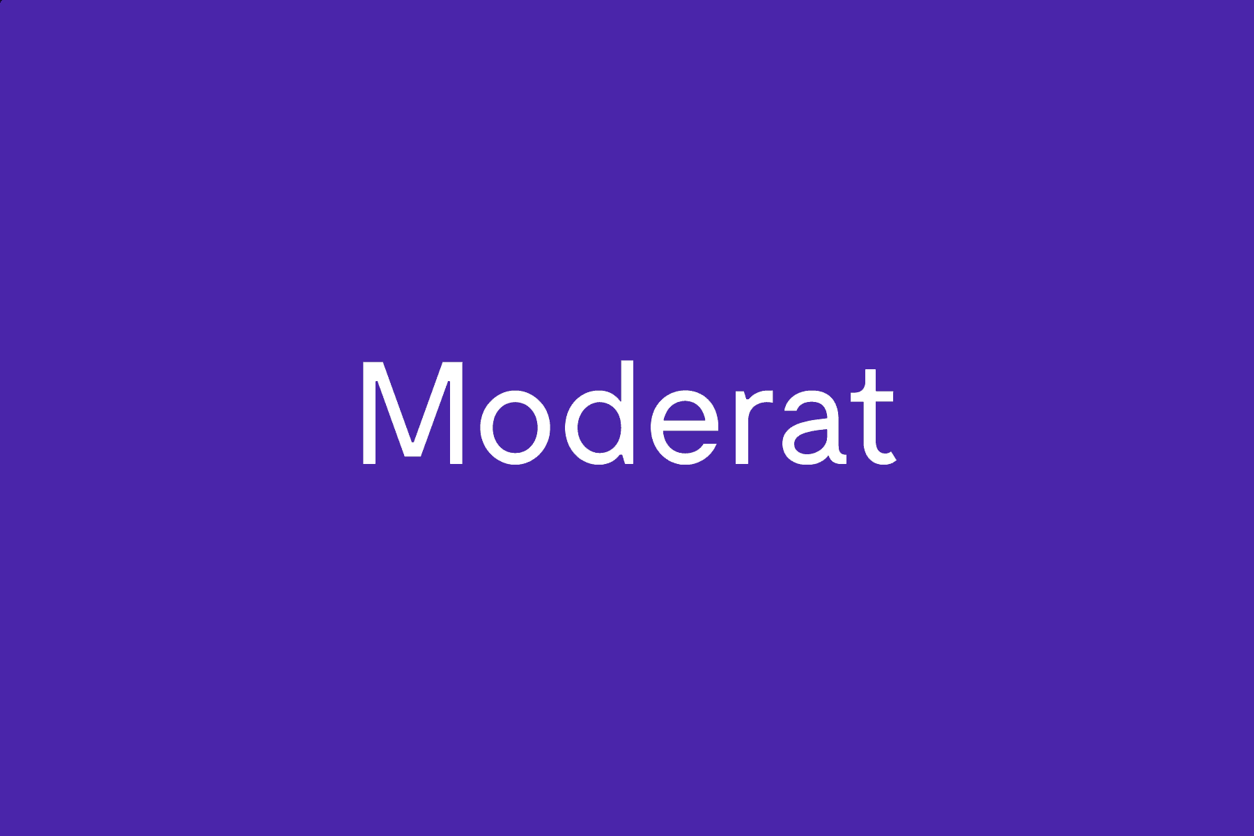
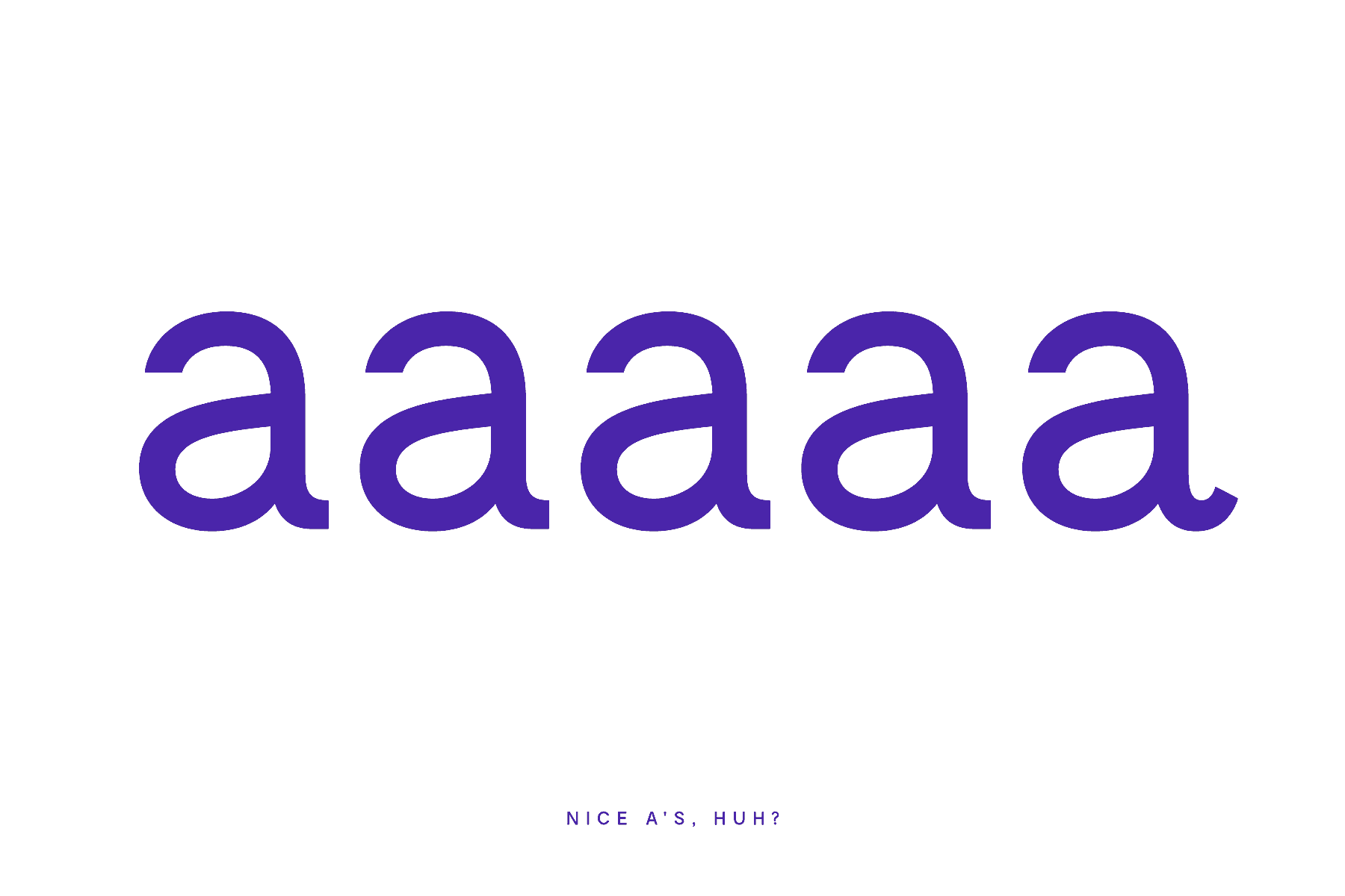
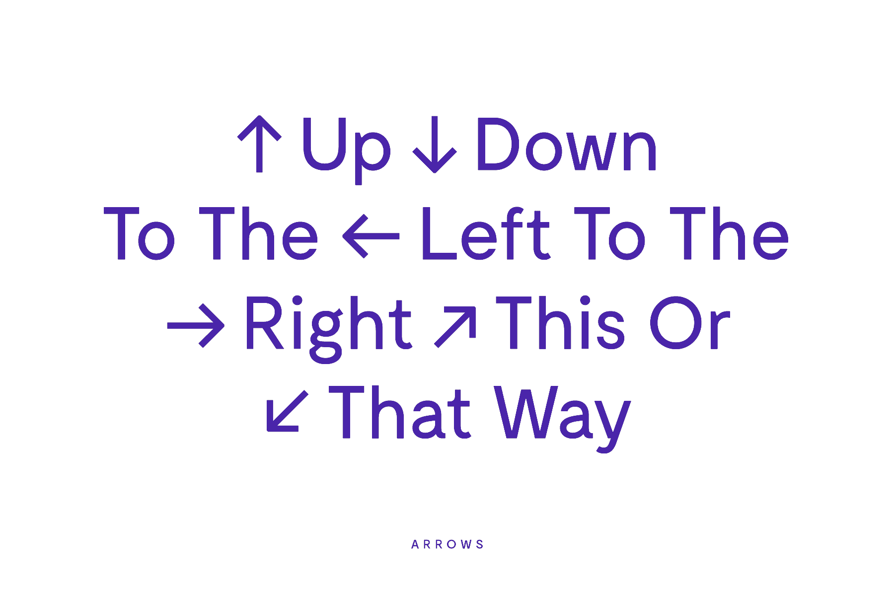
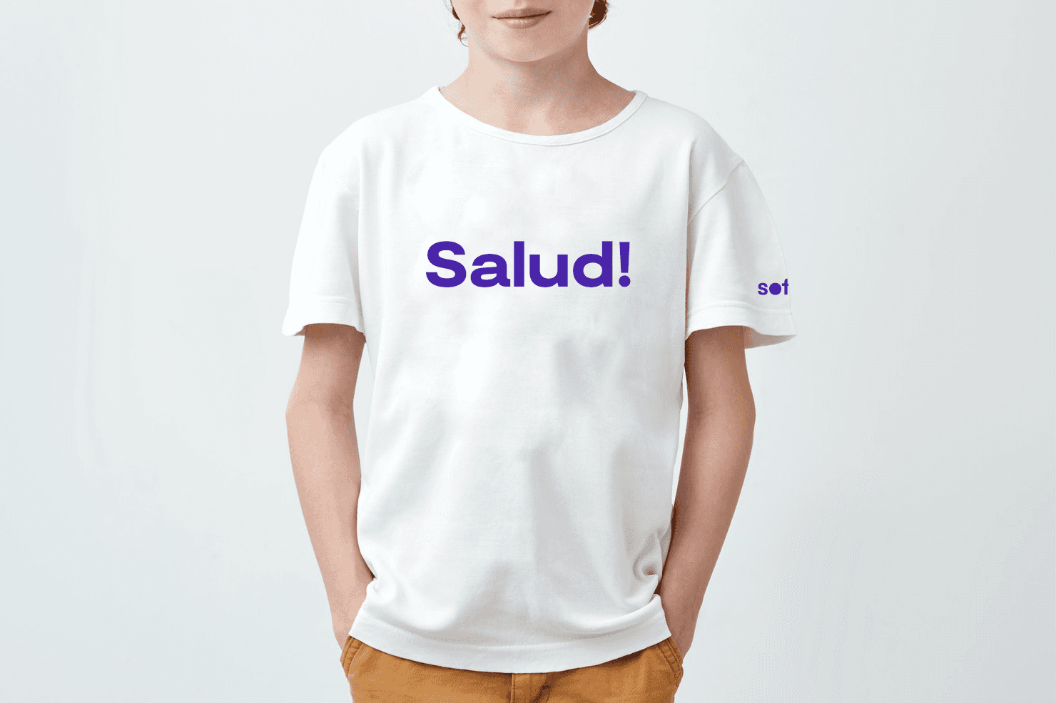
The wordmark is based on Moderat, a typeface with a timeless and familiar feel. It's refined and sophisticated (we see it in the a) without feeling unreachable. All the letters are in lower case to differentiate from a real name and to convey friendliness.


A UNIQUE VISUAL WORLD
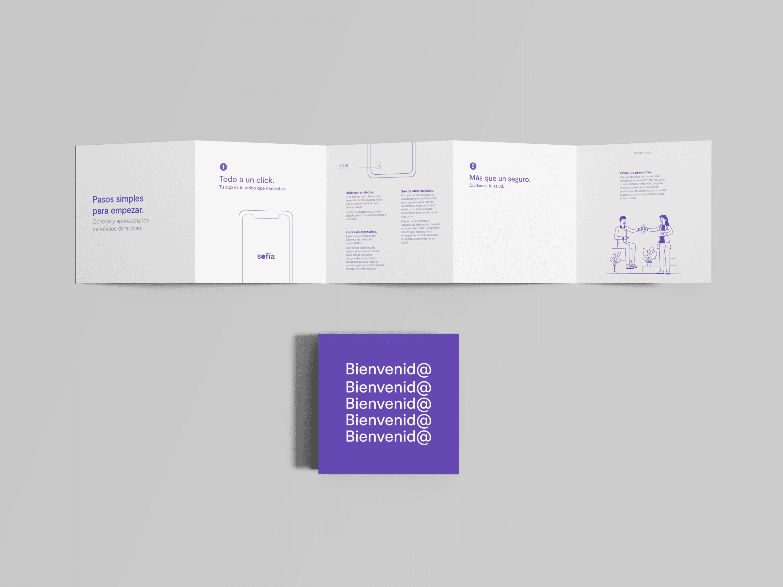
The talented illustrator Yisman brought our vision to life with his unique style, reinforcing the brand identity through a limited color palette and organic shapes. Our goal was to portray real, diverse individuals in familiar local moments, reflecting the meaning of health by radiating positivity and inspiration. As Sofía is Mexico’s first digital insurance designed to accompany you everywhere, we aimed to show what life looks like with Sofía by your side-always present, supportive, and part of everyday experiences.


A CHALLENGE OF SIMPLICITY
From the outset, I knew I wanted a wordmark. The name Sofía was bold, distinctive, and unlike any other health insurance brand in Mexico. My goal was to make the name itself the hero, ensuring the brand would be recognized and remembered through its unique identity.
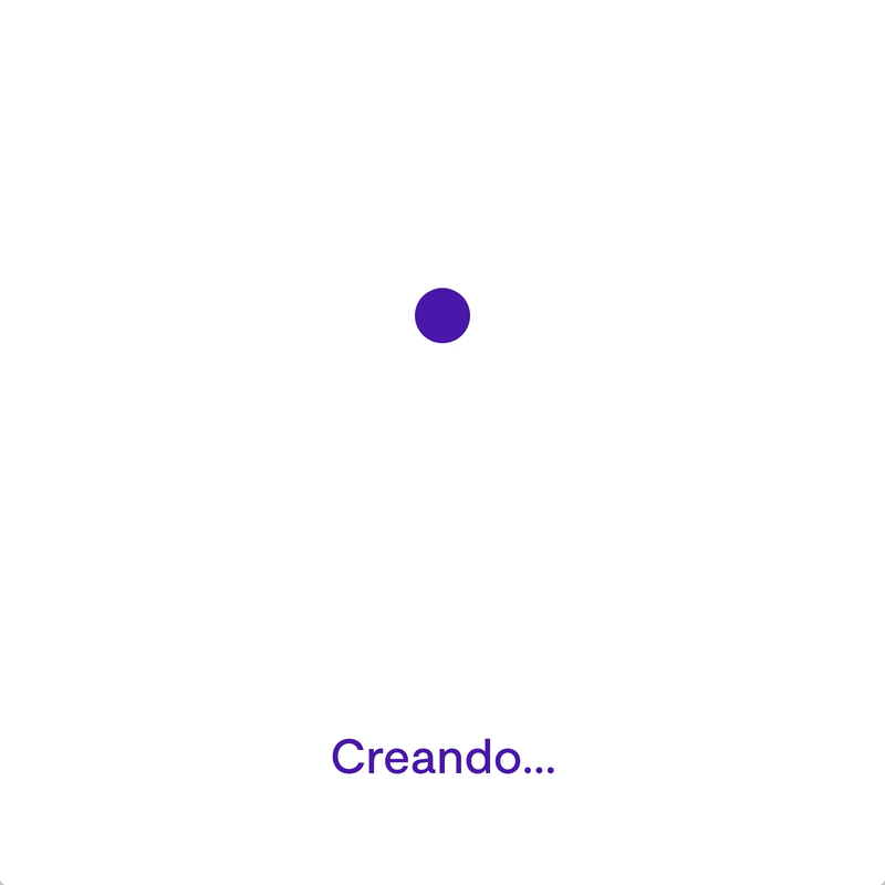
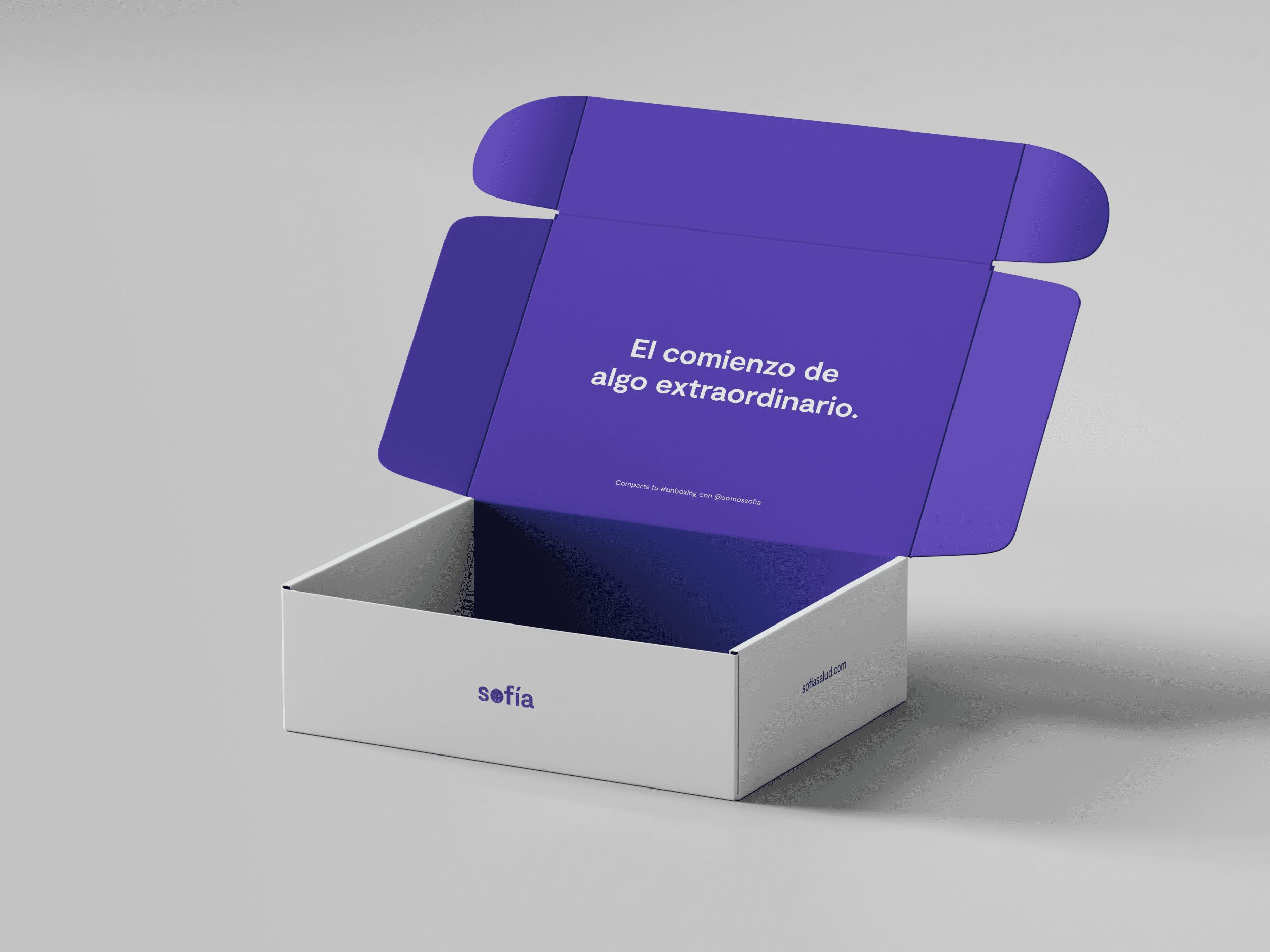
At the same time, I needed a simple, versatile mark for social media and the app icon. Initially, I thought the ‘s’ would become the defining symbol, but through the design process, the ‘o’ unexpectedly emerged as the standout feature and ultimately became the brand’s signature mark.


THE RESULT
A radically different kind of health insurance for Latin America—simple, human, and open. The opposite of the cold, rigid, square systems people are used to.
The Sofía Brand Book distills the essence of the brand into a single, comprehensive website. It outlines the brand’s foundation, values, mission, assets, and vision. This project represents the longest engagement I’ve had with a single brand, reflecting its broad scope and depth.
MY ROLE
4th Hire
Branding
COMPANY
Sofia
CREATED
2019
A brand to break old industry perceptions
Sofía is radically different from any health insurance company in Latin America. The brand is all about innovation and people. It voices a young, rebel and creative spirit with a simple, honest and human message.
The circle, a symbol for a movement
The circle embodies wholeness, reliability and movement. It's the antithesis of a square, rigid, closed-minded insurance world. The purple represents wisdom (Sofía in latin is wisdom), ambition and abundance.
Square vs Circle Marketing Strategy by Alberto Montalti
A BEAUTIFUL TYPEFACE
The wordmark is based on Moderat, a typeface with a timeless and familiar feel. It's refined and sophisticated (we see it in the a) without feeling unreachable. All the letters are in lower case to differentiate from a real name and to convey friendliness.
A UNIQUE VISUAL WORLD
The talented illustrator Yisman brought our vision to life with his unique style, reinforcing the brand identity through a limited color palette and organic shapes. Our goal was to portray real, diverse individuals in familiar local moments, reflecting the meaning of health by radiating positivity and inspiration. As Sofía is Mexico’s first digital insurance designed to accompany you everywhere, we aimed to show what life looks like with Sofía by your side-always present, supportive, and part of everyday experiences.
A CHALLENGE OF SIMPLICITY
From the outset, I knew I wanted a wordmark. The name Sofía was bold, distinctive, and unlike any other health insurance brand in Mexico. My goal was to make the name itself the hero, ensuring the brand would be recognized and remembered through its unique identity.
At the same time, I needed a simple, versatile mark for social media and the app icon. Initially, I thought the ‘s’ would become the defining symbol, but through the design process, the ‘o’ unexpectedly emerged as the standout feature and ultimately became the brand’s signature mark.
THE RESULT
A radically different kind of health insurance for Latin America—simple, human, and open. The opposite of the cold, rigid, square systems people are used to.
The Sofía Brand Book distills the essence of the brand into a single, comprehensive website. It outlines the brand’s foundation, values, mission, assets, and vision. This project represents the longest engagement I’ve had with a single brand, reflecting its broad scope and depth.